Brochures and Literature
I have had the pleasure of designing and laying out hundreds of pieces of literature in my career. I've developed everything from single-page flyers, to multi-page brochures, to half-fold, trifold, and quad-fold pamphlets, to 1,000+ page product catalogs.
Things have changed over the years. Whereas I used to design primarily for print, delivering the work digitally now takes a bit more precedence. That said, the underlying principles remain the same - clearly communicate the message in a concise and visually attractive way, encouraging the viewer to buy.
Cooledge Lighting
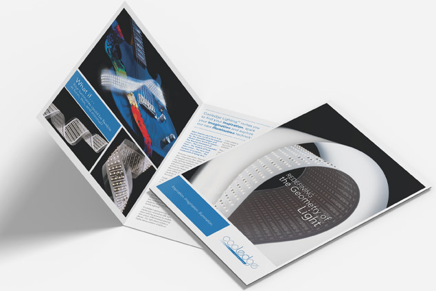
I started working with Cooledge Lighting during the company's startup phase. The first pieces I developed were introductory, as a lot of the final specifications had yet to be approved. Although the audience veered towards the technical, I needed to place photography and general ideas at the forefront. I needed to grab their interest while providing very little specific product information.
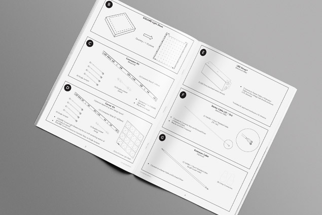
As the product developed, the focus shifted to more technical documents. Working with the product engineers and product manager, I created specification sheets and instruction booklets. These were not glamorous but extremely important. For the instruction sheets, we chose to go with primarily black and white pieces. I created numerous illustrations and laid them out in a step-by-step manner to not only instruct the user on how to use the product but also to show how it could help them solve their lighting problems.
Download the Cooledge Brochure (PDF)
Download the Cooledge Instruction Booklet (PDF)


Ampersand Art Supply
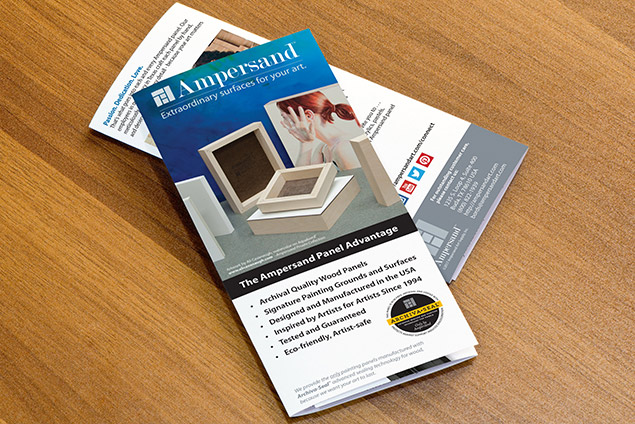
Ampersand manufactures consumer products, so typically, there is not a lot of product literature used. However, there is a necessary education required to explain and teach the importance of using an Ampersand panel over stretched canvas.
Since distribution opportunities are limited, size matters. We must display the literature in the rack alongside the product in retail stores. For that reason, the pieces are trifold or quad-fold. It can be quite a challenge to fit all of the necessary information and display it in a way that is, so brevity in the copy is critical.
When it came time for their latest product - Floaterframe – I was under the same restrictions. I approached the piece as a trifold. When opened, the story of the product unfolds in a visually appealing way and walks the consumer through the Floaterframe narrative. On the back panel, we show how easy it is to use in a step-by-step photo layout.
Download the Ampersand Brochure (PDF)
Download the Ampersand Floaterframe Brochure (PDF)

Let’s work together!
I'm always open to new creative collaborations, whether freelance design or marketing projects or full-time opportunities. Reach out, and I'll get right back with you.
Thank you
Your message has been successfully sent...
Sorry
Something seems to have gone wrong!